Color is fundamental to visual communication and design. In the digital world, understanding color models is essential for designers, developers, and anyone working with visual content. Color models are systems that use numerical values to represent colors, ensuring consistency and accuracy across different mediums. This article delves into key color models – RGB, CMYK, HSL, and Hexadecimal codes – and highlights the importance of the Color Wheel Online in understanding and applying color theory in digital design.
Understanding Different Color Models
Several color models are used in digital design, each serving specific purposes and applications.
RGB (Red, Green, Blue)
The Red, Green, Blue (RGB) color model is the cornerstone of screen-based design. It’s an additive color model, meaning it creates colors by adding red, green, and blue light together. This model is based on human perception and how our eyes interpret light. RGB is the foundation for everything we see on screens, from websites to mobile apps and digital displays. Think of your monitor or phone screen; each pixel emits light in these three primary colors, blending them to create the vast spectrum of colors we perceive.
CMYK (Cyan, Magenta, Yellow, Key/Black)
Cyan, Magenta, Yellow, and Key (CMYK) is a subtractive color model primarily used for printing. Unlike RGB, CMYK works by subtracting wavelengths of light from white light. These colors – cyan, magenta, and yellow – are the complements of red, green, and blue. The ‘K’ stands for ‘key,’ which is black, added to create deeper blacks and improve print contrast. CMYK is crucial for print design because it accurately represents how colors are produced using ink pigments on paper.
HSL (Hue, Saturation, Lightness) and the Color Wheel
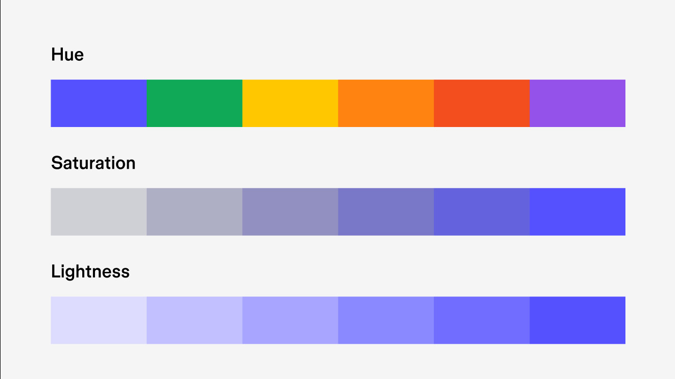
Hue, Saturation, and Lightness (HSL) offer a more intuitive way to understand and manipulate colors.
- Hue: Hue refers to the pure color itself, positioned on a color wheel online. Imagine a 360-degree circle where each degree represents a different hue, moving through the spectrum from red to yellow, green, cyan, blue, magenta, and back to red. The color wheel online is an invaluable tool for visualizing hues and their relationships.
- Saturation: Saturation is the intensity or purity of a hue. High saturation means a vibrant, rich color, while low saturation results in a duller, more muted color. On a color wheel online, saturation can be visualized as moving from the center outwards; the closer to the edge, the more saturated the color.
- Lightness: Lightness determines how much white or black is mixed into a hue. Increasing lightness moves a color towards white (creating tints), while decreasing lightness moves it towards black (creating shades).
 Understanding Hue Saturation and Lightness (HSL) Color Model with Online Color Wheel
The color wheel online is not just a visual aid for HSL; it’s a practical tool for designers to select harmonious color combinations, understand color relationships (like complementary, analogous, and triadic colors), and adjust hues, saturation, and lightness dynamically. Many color wheel online tools also provide HSL values, making it easier to translate visual selections into numerical values for design software.
Hexadecimal Codes
Hexadecimal codes, or hex codes, are used to represent colors in HTML, CSS, and other web technologies. A hex code is a six-digit combination of letters and numbers preceded by a hash symbol (#). Each pair of digits represents the intensity of red, green, and blue components in the RGB model.
For example, in the hex code #RRGGBB, RR is for red, GG for green, and BB for blue. Hexadecimal uses a base-16 system, using digits 0-9 and letters A-F (representing 10-15). This system allows for 256 values for each color component (00 to FF in hexadecimal, equivalent to 0 to 255 in decimal), resulting in over 16 million possible colors.
Understanding hex codes is crucial for web designers and developers to ensure consistent color rendering across web pages and applications. Tools and color wheel online platforms often provide hex code equivalents for selected colors, bridging the gap between visual color selection and code implementation.
Color Profiles: sRGB and P3 for Digital Consistency
Color profiles are essential for maintaining color consistency across different devices and platforms. In digital design, two prominent color profiles are sRGB and P3.
sRGB (Standard RGB) has been the standard color profile for the web for decades. It ensures that colors appear reasonably consistent across most monitors, browsers, and devices. For content creators and web designers, sRGB is a reliable choice for achieving visual consistency on a wide range of consumer devices.
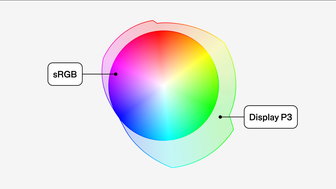
Display P3, often simply called P3, is a wider color gamut profile that can display a significantly larger range of colors, approximately 49% more than sRGB. P3 offers richer and more vibrant colors, making it ideal for high-definition displays and platforms like iOS and retina screens. However, using P3 on devices designed for sRGB might lead to increased energy consumption as the device works harder to render the extended color range. While P3 offers superior color fidelity, it’s important to consider device compatibility and application support.
 P3 Color Profile for Digital Design Displaying a Wider Color Gamut Than sRGB
Choosing the right color profile depends on the project’s needs and target audience. For broad web compatibility, sRGB remains a safe choice. For projects targeting modern, high-definition displays and aiming for richer color representation, P3 is increasingly becoming the preferred option.
WCAG and Color Accessibility: Designing for Everyone
Color accessibility is a critical aspect of inclusive design. The Web Content Accessibility Guidelines (WCAG), developed by the World Wide Web Consortium (W3C), provide standards to ensure web content is accessible to users with disabilities. Color contrast is a significant factor in visual accessibility.
WCAG guidelines specify minimum contrast ratios between text and background colors to ensure readability for users with visual impairments, including color blindness and low vision. For example, WCAG 2.1 recommends a minimum contrast ratio of 4.5:1 for normal text and 3:1 for large text. These ratios ensure that text and interactive elements are distinguishable against background colors, making content accessible to a broader audience.
WCAG 3.0, currently under development, is expected to introduce even more nuanced guidelines for color contrast and accessibility, further emphasizing the importance of thoughtful color choices in digital design.
Utilizing a color wheel online can also aid in selecting color palettes that not only look aesthetically pleasing but also meet accessibility standards. Many online tools include accessibility checkers that evaluate color contrast based on WCAG guidelines, helping designers make informed decisions.
Conclusion
Understanding color models – RGB, CMYK, HSL, and Hex codes – is fundamental for anyone working in digital design. The color wheel online is an indispensable tool for exploring color theory, selecting harmonious color palettes, and ensuring designs are both visually appealing and accessible. By leveraging the power of the color wheel online and understanding different color models, designers can create impactful and inclusive digital experiences. Embracing these tools and principles leads to more effective and user-centered design practices in the digital age.
